Have You Ever Thought of Creating a Slider or Rating Bar Using a Line Chart in Power BI?
 By Keyur Patel
October 8, 2026
6 min read
By Keyur Patel
October 8, 2026
6 min read
Introduction
- One of our clients conducts employee surveys using Self and Peer assessments. Each survey contains multiple questions grouped into different categories, with responses scored on a scale of 0–100.
- To interpret the results, they defined three fixed performance ranges:
- Off-Track
- On-Track
- Exceptional
- Their requirement was to plot the actual score for each question on this fixed rating scale, distinguish Self and Peer responses using different colors, and support multiple questions in a clean, interactive visualization.
- In this blog, we’ll achieve this using a native Power BI Line Chart without any custom visuals.
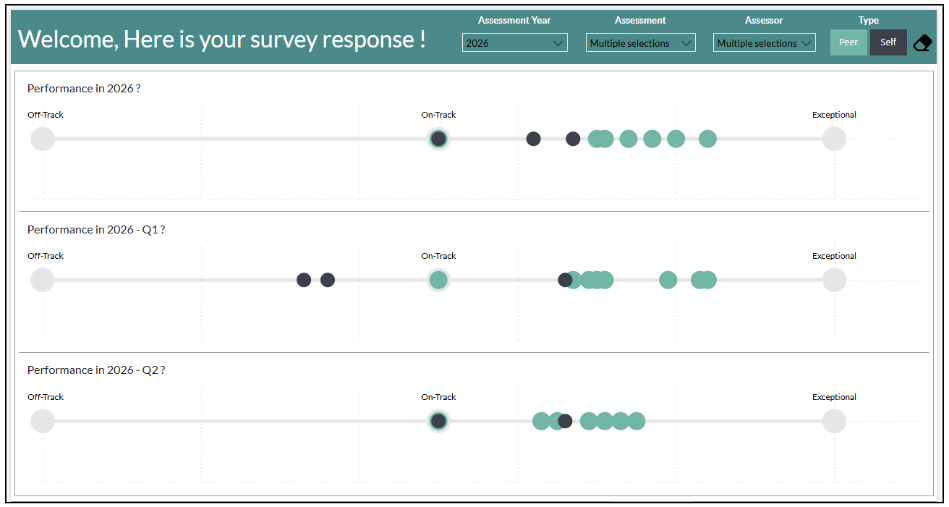
To build this visualization, we followed the steps below.
Step 1: Data Model
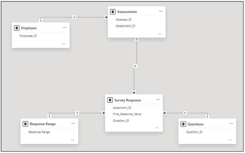
Our data model consists of four tables:
- Employee – Stores Employee ID and Employee Name.
- Assessment – Contains Assessment ID, Employee ID, and Assessment Type (Self or Peer).
- Questions – Stores the Question ID, Question, and Question Category.
- Survey Response – Acts as the fact table, storing the Assessment ID, Question ID, and the corresponding Rating for each question.
- We need one table that will have a continuous range from 0-100.
- For that, create a new calculated table using the GENERATESERIES function to generate continuous values from 0 to 100.
Response Range = GENERATESERIES (0, 100, 1)
- This table acts as a fixed rating scale for visualization.
- Use the generated values as the X-axis in the timeline visual.
- Since all assessment ratings fall within the 0–100 range, this provides a consistent scale for plotting the rating indicator.
- Use this column in relationship with the response value in the Survey response table.
Step 2: Configure the Timeline Visual
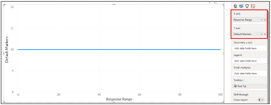
- Add the Line Chart visual to the report canvas.
- Drag the Value column from the Rating Scale (calculated table) to the X-axis of the visual.
- The scale will serve as the base on which the assessment rating indicator will be plotted in the following steps.
Step 3: Create the Default Marker Line
- Create the following measure to generate a constant reference line with predefined marker positions.
Default Markers =
VAR result =
SELECTEDVALUE ( ‘Response Range'[Response Range] )
RETURN
IF ( result = 0 || result = 50 || result = 100 || result = 120, 10)
- Open the Format pane for the timeline visual.
- Change the constant line color to Grey to create the base assessment scale.
- Turn Markers On.
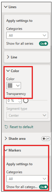
- Adjust the marker size according to your preferred appearance.
- You will now see markers displayed at the positions specified in the Default Markers measure (e.g., 0, 50, and 100). These markers will later be used to display the default labels such as Off-Track, On-Track, and Exceptional.
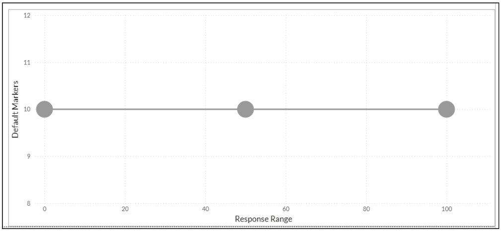
Note: Adjust the X-axis so the constant line can have some space in starting and end, and markers can be displayed properly.
Step 4: Create the Range Label Measure
- Create the following measure to display the labels for each predefined marker on the assessment scale.
Range Label =
VAR maximum =
SELECTEDVALUE ( ‘Response Range'[Response Range] )
RETURN
SWITCH (
TRUE (),
maximum = 0, “Off-Track”,
maximum = 50, “On-Track”,
maximum = 100, “Exceptional”
)
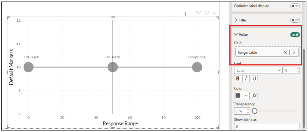
- Assign the Range Label measure as the Data Label for the Default Markers line.
- The markers will now display the corresponding labels (Off-Track, On-Track, and Exceptional) instead of numeric values.
Step 5: Create the Peer Response Marker Measure
- Create the following measure to dynamically plot the Peer Assessment rating on the assessment scale.
Response marker peer =
VAR IsPeerSelected=
CONTAINS(
VALUES(Assessments[Assessment Type]),
Assessments[Assessment Type],
“Peer”
)
VAR ResponseValue =
CALCULATE(
MAX(‘Survey Response'[Final_Response_Value]),
Assessments[Assessment Type] = “Peer”
)
VAR ResponseRange =
SELECTEDVALUE(‘Response Range'[Response Range])
RETURN
IF(
IsPeerSelected
&& ResponseValue == ResponseRange,
10,
BLANK()
)
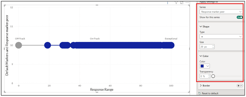
- Add the Response Marker – Peer measure to the Y-axis of the timeline visual.
- This measure compares the survey response rating with each value on the X-axis (Rating Scale).
- When the response rating matches the current X-axis value, the measure returns a value, causing a marker to be plotted at that position.
- Now, in Format Visual, we will turn off the data label, give the same grey colour to the line as we gave it to the default marker and assign any preferred colour to the marker as we need to differentiate peer and self-assessment.
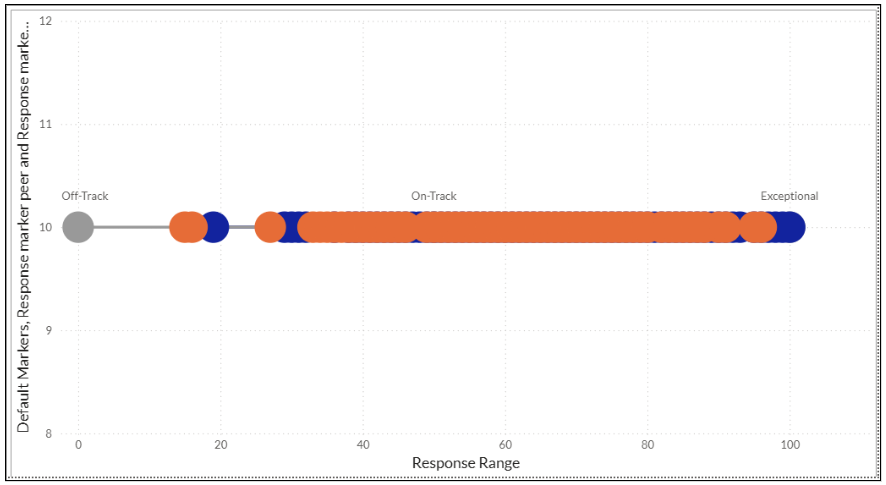
Write the same measure for Response Marker – Self by replacing the “Peer” filter with “Self” and following the same UI Formatting.
Step 6: Set different size for the Peer and Self markers
- It is possible for the Self and Peer assessment responses to have the same score.
- In such cases, both markers overlap at the same position, making one of them difficult to see.
- To ensure both responses remain visible, reduce the marker size of one of the assessment series.
- In this example, we have reduced the Self Assessment marker size, allowing both markers to be distinguished even when they overlap.
Step 7: Finalize the Visual Formatting
- Open the Format pane for the timeline visual.
- Turn off the X-axis and Y-axis titles, labels, and values to create a clean, minimalist appearance.
- Drag the Question field to the Small Multiples section of the visual.
- The visual will now create a separate timeline for each survey question, allowing users to easily compare the Self and Peer assessment ratings across all questions while maintaining a consistent assessment scale.
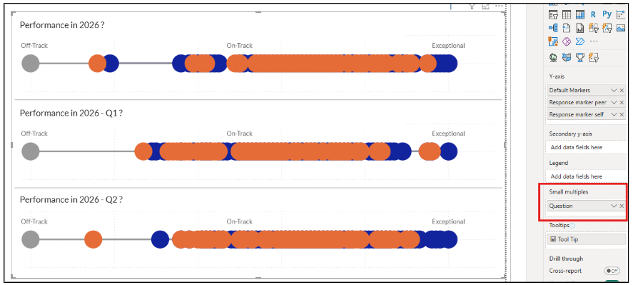
Note: If your survey contains multiple Question Categories, you can create a separate report page for each category. This keeps the report organized, improves readability, and allows users to focus on one assessment area at a time while using the same visualization design across all categories.
Step 8: Add the Required Slicers
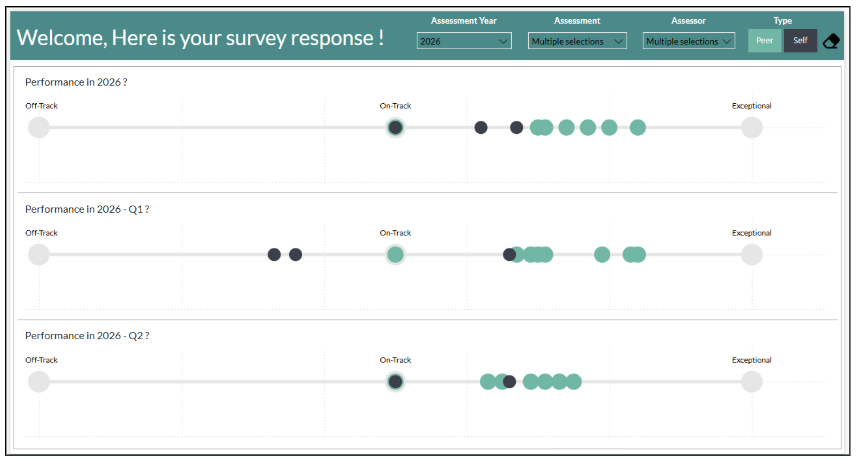
- Add the required slicers to the report.
- Match the Self and Peer slicer selection colors with their respective marker colors for a consistent user experience.
- Adjust the remaining formatting to align with your report theme.
Conclusion
Using a combination of DAX measures, Small Multiples, and a few strategic formatting changes, we transformed a native Power BI Line Chart into a clean and interactive rating scale. By hiding unnecessary chart elements and customizing markers, the visual no longer appears as a traditional line chart but instead resembles a dedicated assessment scale.
This approach allows us to compare Self and Peer assessment scores across multiple survey questions while maintaining a consistent and intuitive user experience. Most importantly, the entire solution is built using native Power BI visuals, eliminating the need for any external custom visuals while keeping the report lightweight, scalable, and visually appealing.