
Using Matrix as a Heat Map: Visualizing Planned vs Actual Stage Dates in Power BI alternative of Gantt Chart
Inkey Solutions, June 17, 20251482 Views
What is a Heat Map Matrix in Power BI?
A heat map using a matrix visual in Power BI is a technique where cell backgrounds are conditionally formatted based on values or logic, allowing users to quickly identify patterns, ranges, and anomalies. This method is especially powerful when representing timelines or comparisons over a series of dates.
Overview
In our scenario, we needed to build a KPI visual for a Project Management System that compares the Planned vs Actual Dates for various project stages. Traditionally, this is done using a Gantt chart. However, we encountered a limitation:
Gantt visuals in Power BI do not support displaying two end dates simultaneously—one for estimated completion and another for actual completion.
This limitation prompted us to find an alternative way to present timeline data without compromising clarity or functionality.
__________________________________________________
Visual Limitation of Gantt Chart (Before)
Before implementing the Matrix Heat Map, we initially attempted to use the Gantt chart visual in Power BI to track stage timelines. Here’s how it looked:
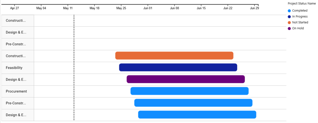
Iinitial Gantt chart showing only one set of dates per stage
While this provided a visual timeline, we faced a significant limitation:
Gantt charts do not support displaying both Estimated and Actual end dates simultaneously.
This made it impossible to visually compare delays, early completions, or overlaps between planned and actual timelines.
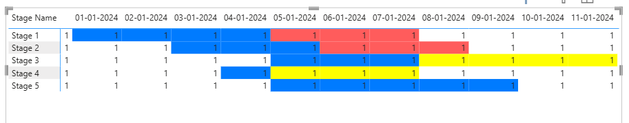
Enhanced Visualization Using Matrix Heat Map (After)
To overcome this, we developed a custom solution using a Matrix visual with conditional formatting. The result: a timeline-style heat map that accurately reflects both Planned and Actual durations.
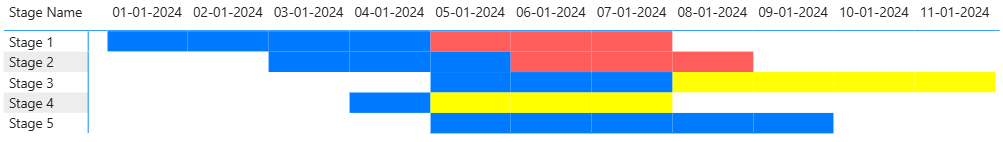
Matrix visual with conditional formatting to compare planned vs actual stage dates
Now, users can clearly see:
- Delayed stages (where red extends beyond blue)
- Early completions (blue shorter than yellow)
- On-time completions (blue overlaps perfectly)
__________________________________________________
Steps to Implement Matrix
Step 1: Prepare the Data Model
Ensure your dataset contains the following key columns:
- Stage Name
- Actual Start Date
- Planned End Date
- Actual End Date
- A Calendar Table (with continuous dates for your desired timeline)
Step 2: Create DAX Measure
The following measures were created: a simple Dummy measure to enable conditional formatting in the matrix.
![]()
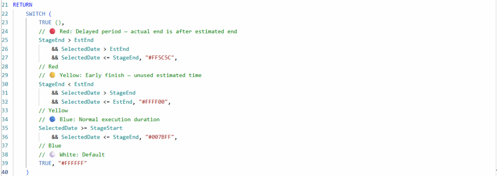
And a CF measure that dynamically assigns colors based on the relationship between Actual End Date and Estimated End Date, as shown below.
CF Day Matrix =
VAR SelectedDate = SELECTEDVALUE(‘Date'[Date])
VAR SelectedStage = SELECTEDVALUE(Sheet1[Stage Name])
VAR StageStart =
CALCULATE(
MAX(Sheet1[Start Date]),
Sheet1[Stage Name] = SelectedStage
)
VAR StageEnd =
CALCULATE(
MAX(Sheet1[Actual End Date]),
Sheet1[Stage Name] = SelectedStage
)
VAR EstEnd =
CALCULATE(
MAX(Sheet1[Estimated End Date]),
Sheet1[Stage Name] = SelectedStage
)
RETURN
SWITCH(
TRUE(),
// 🔴 Red: Delayed period — actual end is after estimated end
StageEnd > EstEnd &&
SelectedDate > EstEnd &&
SelectedDate <= StageEnd,
“#FF5C5C”, // Red
// 🟡 Yellow: Early finish — unused estimated time
StageEnd < EstEnd &&
SelectedDate > StageEnd &&
SelectedDate <= EstEnd, “#FFFF00”, // Yellow
// 🔵 Blue: Normal execution duration
SelectedDate >= StageStart && SelectedDate <= StageEnd, “#007BFF”, // Blue
// ⚪ White: Default
TRUE, “#FFFFFF”
)
Step 3: Build the Matrix Visual
- Add a Matrix visual to your report page.
- Assign the fields:
- Rows: Stage Name
- Columns: Date (from your Calendar table)
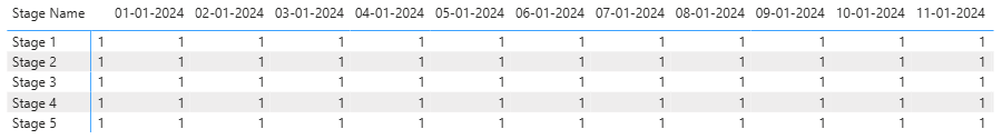
- Values: Dummy measure (have 1’s only)
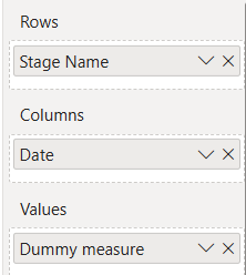
After assigning the appropriate fields to Rows, Columns, and Values, the Matrix visual starts to take shape as shown below.
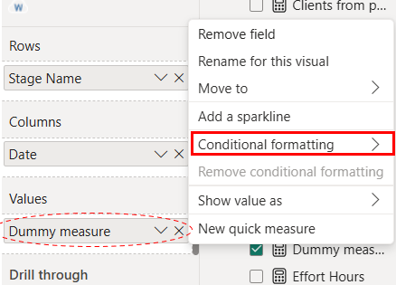
Step 4: Apply Conditional Formatting
- Right click on the Values field in the Matrix visual.
- Click Conditional formatting → select Background color.
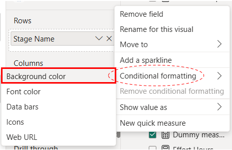
- Select format style to field value.
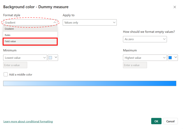
- In the base field dropdown list select CF measure. (Measure which we have created)
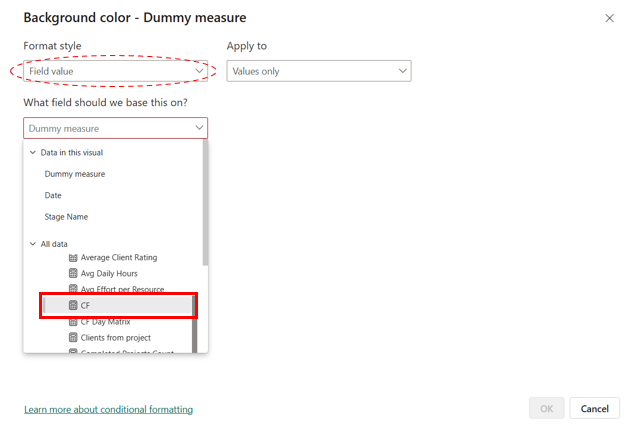
After completing these steps, you will see a partially formatted Matrix visual as shown below.
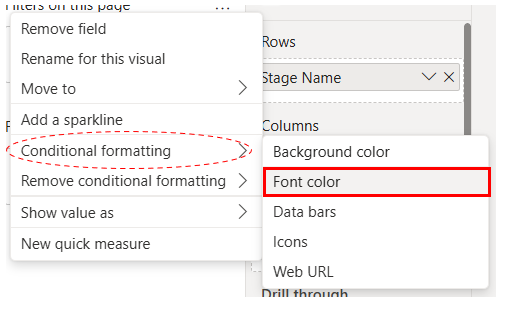
To hide the 1’s in each cell, apply the same conditional formatting to the Font color so only the background color is visible.
After completing all the steps, you’ll get the expected output—a Matrix visual functioning as a heat map.

__________________________________________________
Conclusion
Using a Matrix visual with conditional formatting in Power BI provides a flexible and effective alternative to Gantt charts for comparing planned vs actual stage timelines. By leveraging simple DAX measures and a calendar table, we were able to highlight delays, early finishes, and execution periods in a clear, color-coded format. This approach not only overcomes the limitations of standard Gantt visuals but also enhances user interactivity and report performance.
Note: This scenario is based on a daily timeline. If your timeline spans months or years, please refer to this blog.
Reference Link : – https://inkeysolutions.com/overlapping-clustered-bar-chart-for-estimating-project-completion-dates/