Executive Summary
Urban mobility is at the core of smart city planning. For companies, the need to understand trip behavior, station utilization, and rider demographics is crucial. However, the absence of an automated, scalable analytics solution hindered their ability to make timely, data-driven decisions.
INKEY IT Solutions delivered a full-stack data engineering solution on Microsoft Fabric, transforming unstructured bike-sharing data into rich, actionable insights via a layered Medallion Architecture and Power BI dashboards. The implementation simplifies planning, optimizes operations, and empowers stakeholders across operations, planning, and marketing.
Project Background: The Challenge
Client offers a public bike-sharing system with hundreds of stations. They collect vast amounts of CSV-formatted data stored in Google Cloud Storage (GCS) but faced critical challenges:
Key Problems
- No automated ingestion of historical or daily data
- Difficulty cleaning, transforming, and analyzing unstructured CSVs
- Poor traceability and data quality assurance
- No centralized reporting or monitoring platform
- Delay in strategic decision-making due to manual reporting
- Lack of rider behavior visibility
- Inability to evaluate station-wise or region-wise demand
- No insight into bike and dock maintenance needs
Project Goals
- Automate daily ingestion of raw bike trip and station data
- Transform data using structured, traceable pipelines
- Deliver business-ready, curated datasets for analytics
- Provide deep insights via Power BI dashboards
- Enable data-driven decisions for planning, maintenance, and marketing
Fabric Architecture: End-to-End Data Engineering
Layered Medallion Design
We adopted a Bronze-Silver-Gold Architecture with Microsoft Fabric to bring structure, scale, and transparency:
| Layer |
Description |
| Bronze |
Raw data ingestion with minimal/no transformation |
| Silver |
Cleaning, enrichment, and schema standardization |
| Gold |
KPI calculation and aggregation for business use |

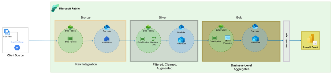
Lakehouse & Warehouse Setup
- Lakehouse: Hosts Bronze and Silver layers using Delta format
- Warehouse: Gold layer tables optimized for Power BI
Scheduling
- Daily file ingestion scheduled to run at 7 AM UTC
- Uses T+1 logic: Files ingested the day after generation
Transformation Tools
- Data Pipelines: Orchestrate data movement end-to-end
- Dataflow Gen2: No-code transformations in Silver layer
- Stored Procedures: Gold layer aggregations and business rules
Robust Error Handling with Alerting
To ensure reliability, INKEY implemented a metadata-driven error handling framework with automatic alerts.
Control and Logging Tables
| Table |
Description |
| JobControl |
Defines job configuration |
| JobLog |
Logs each job run with status and timestamps |
| JobError |
Captures detailed error messages if a job fails |
Email Alerts
- Sent to stakeholders on success/failure
- Includes JobLogKey, Job Name, and Error Details if failed
Retry Logic
- Failed jobs can be re-run from control tables
- Archived files are reused for reprocessing
Solutions by INKEY: Engineering for Impact
What We Did
- Built a fully automated data ingestion and transformation system using Fabric
- Engineered scalable ETL pipelines that adapt to growing data volumes
- Applied dimensional modelling (star schema) in the Gold layer
- Developed visually-rich Power BI dashboards for decision-makers
Key Features Delivered
- Automated Bronze-Silver-Gold pipeline with metadata logging
- Full data quality validation at Silver layer
- Role-based access and audit-compliant lineage
- Power BI dashboards covering:
- Usage & Trends
- Station Performance
- Regional Demand
- User Demographics
- Maintenance Overview
Transformations: From Chaos to Clean
| Stage |
Operations |
| Bronze Layer |
Ingest raw CSVs, log metadata |
| Silver Layer |
Deduplication, null filtering, column renaming, derived fields |
| Gold Layer |
Aggregation, joins, KPIs, dimensional modelling |
Comprehensive Power BI Dashboard
The Dashboard Views
- Business Health:
- Snapshot of system health: bike/dock availability, downtime %, waiting times, outages, failed rentals.
- KPIs, downtime trends & heatmaps for quick problem-spotting.
- Nearest-station widget shows 1st, 2nd & 3rd closest stations to reroute users.
- Trips:
- Trends over time, member vs. customer split, peak hours, and demand forecast.
- Highlights weekday vs. weekend patterns and station-level waiting times.
- Drill-Through: Raw trip data (ID, stations, duration, revenue, feedback).
- Maintenance & Rebalance:
- Tracks reported, in-progress & resolved issues + average service times.
- Shows monthly rebalance trips, workload trends, and turnaround efficiency.
- Drill-Through: Detailed rebalance trips (stations, bikes moved, timings).
- Trip Map
- Interactive map of trips starting from a selected station.
- Visualiz0es destinations, popular outbound connections & station reach.
- Drill-Through Pages (Trip Details & Rebalance Trip Details)
- Trip Details: Full trip records (stations, timings, revenue, feedback).
- Rebalance Trip Details: Complete rebalance operations (stations, bikes, timings).
Smart Features
- Nearest-station widget showing 1st, 2nd & 3rd closest stations to reroute users during downtime or capacity issues.
- Heatmaps to track outages and waiting times by station and time of day.
- Station-origin mapping to track where trips begin and how far they extend.
Insights & Decision-Making Enablement
Operational Insights
- Pinpoint stations with high downtime or frequent outages.
- Monitor bike/dock availability to avoid shortages.
- Track failed rentals and waiting times to improve customer satisfaction.
- Optimize maintenance scheduling to reduce system downtime.
User & Demographics
- Compare member vs. customer trips to tailor engagement strategies.
- Identify time-of-day and day-of-week peaks for better rebalancing.
- Understand forecasted demand to anticipate supply needs in advance.
Strategic Insights
- Use forecasting outputs to allocate bikes strategically across stations.
- Improve regional coverage by analysing underperforming areas.
- Guide infrastructure investments (new docks, station expansions) with usage evidence.
Results & Business Benefits
- Centralized insights from trips, bikes, docks, maintenance & rebalance data.
- Real-time monitoring of availability, downtime & outages across stations.
- Forecasting integration to balance demand vs. supply proactively.
- Smarter decisions through interactive dashboards & drill through analysis.
- Optimized bike distribution leading to reduced waiting times.
- Proactive maintenance tracking for improved system reliability.
- Scalable framework adaptable to new cities, larger fleets & deeper rider insights.
Post-Implementation Success
- Data-Driven Culture: Teams moved away from manual tracking to a self-service analytics model, where managers and staff rely on the dashboard for daily decisions.
- Cross-Functional Alignment: The unified reporting has created a shared view of performance across operations, planning, and maintenance teams, reducing silos.
- Decision Confidence: Leadership reports higher confidence in planning, budgeting, and investment decisions, as strategies are backed by live data.
Conclusion
The Bike Mobility Analytics solution by INKEY showcases the power of Microsoft Fabric in turning raw, siloed data into meaningful city-scale insights. With automated pipelines, a robust error-handling system, and real-time dashboards, we have empowered client to unlock the full potential of their mobility data.
This blueprint is a reusable foundation for any smart city, urban planning, or mobility provider aiming to use data for better decisions.