Design Smarter Power BI Matrices with Conditional Formatting for Row and Column Totals
Introduction: The Resource Allocation Challenge in IT
Effective resource planning is vital for IT project success, but over-allocating team members or under-allocating projects often creates unnoticed bottlenecks. Traditional project management tools display matrix-style reports but lack visual cues to highlight imbalances.
This blog explores how Power BI’s matrix visuals, enhanced with DAX-based conditional formatting, empower project managers to quickly identify resource and project allocation issues and make informed decisions.
The Issue: Lack of Visual Clarity in Allocation
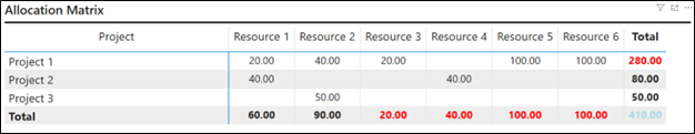
Picture a matrix in Power BI with projects as rows, resources as columns, and allocation hours as values. While this setup shows how hours are distributed, it doesn’t immediately flag problems in the totals:
Resource Totals: Which resources are over-allocated?
Project Totals: Which projects are under-planned?
Without visual cues like color-coding, managers must manually analyze each total, cross-referencing availability and effort data—a time-consuming and error-prone process. In the IT industry, where agility is critical, this inefficiency can derail project success.
The Solution: Conditional Formatting for Matrix Totals
To address this, we developed a custom measure in Power BI to apply conditional formatting to matrix totals, making over-allocated resources and under-planned projects instantly visible. By coloring resource and project totals based on specific conditions, this solution empowers managers to spot issues at a glance and take corrective action swiftly.
Here’s how it works:
- Red for Over-Allocated Resources: If a resource’s total allocation (across all projects) exceeds their available hours, their column total in the matrix turns red.
- Red for Under-Planned Projects: If a project’s planned effort hours are less than its planned billing hours, their row total in the matrix turns red.
- Default Color for Clarity: Non-critical totals (e.g., the grand total) are colored light blue to avoid visual clutter.
This approach transforms a static matrix into a dynamic dashboard, highlighting critical allocation issues without requiring manual calculations.
Implementation: The Power BI Measure
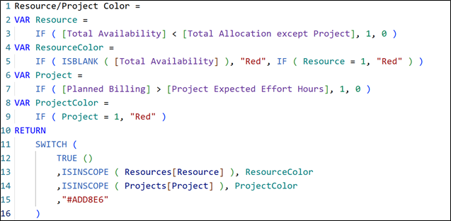
Since Power BI’s native matrix visual doesn’t support applying different conditional formatting logic specifically for row and column totals in a matrix visual, we created a custom DAX measure called Resource/Project Color.
This measure applies conditional formatting specifically to matrix totals, using separate logic for row and column totals—highlighting over-allocated resources in column totals and under-planned projects in row totals.
Supporting Measures Used:

Total Availability: Sums the total available hours of all resources.

Project Expected Effort Hours: Calculates the total expected effort hours planned for all projects.
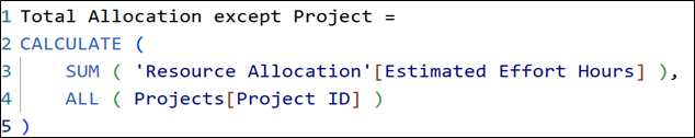
Total Allocation except Project: Calculates total estimated effort hours for resources. It removes project filters/context to show total resource effort across all projects, enabling accurate comparisons and avoiding context bias.

Planned Billing: Sums up the total expected billable hours across all projects.
Actual Measure:
Here’s a simplified explanation of the above measure:
- VAR Resource: Checks if a resource is overallocated by comparing [Total Availability] with [Total Allocation except Project].
- VAR ResourceColor: Assigns “Red” if availability is blank (meaning availability is missing) or if the resource is overallocated (Resource = 1).
- VAR Project: Checks if the project is under-allocated by comparing [Planned Billing] with [Project Expected Effort Hours].
- VAR ProjectColor: Assigns “Red” if the project is under-allocated (Project = 1).
- RETURN block: Checks the scope of resources and projects in the column total and row total to apply the color as per the condition for different dimensions. It also applies “Light Blue(#AD8E6)” color to the grand total.
The result? A matrix where red flags pop out immediately, guiding managers to overallocated resources or under-planned projects in seconds.
How to Implement It
To replicate this solution:
- Set Up Your Matrix: Create a matrix visual in Power BI with projects as rows, resources as columns, and allocation hours as values.
- Define Supporting Measures: Ensure you have all the supporting measures mentioned above.
- Apply the Measure: Use the Resource/Project Color measure for conditional formatting for the totals.
- Test and Refine: Validate the color logic by cross-checking with raw data to ensure accuracy.
Why It Matters
This solution tackles the core issue of visibility in resource allocation. By integrating conditional formatting into the matrix totals, it:
- Saves Time: Managers no longer need to dig through data to identify issues.
- Improves Decision-Making: Clear insights enable proactive adjustments, such as redistributing resources or revising project plans.
In the IT industry, where every hour counts, this approach ensures projects stay on track and teams remain productive without burning out.
Conclusion: A Smarter Way to Manage IT Resources
Resource allocation in the IT industry doesn’t have to be a guessing game. By leveraging conditional formatting in Power BI, we can transform complex data into actionable insights. Our Resource/Project Color measure is a simple yet powerful tool that highlights over-allocated resources and under-planned projects directly in the matrix totals, enabling faster, smarter decisions. In an industry where efficiency is everything, this solution is a game-changer for project managers and teams alike.