Turning a Matrix Visual into a Calendar View in Power BI
Introduction
In Power BI, there is no out-of-the-box calendar visual available by default. To build calendar-style views, users often have to rely on external or custom visuals. While some of these visuals can be useful, not all are Microsoft-certified, and many come with limitations such as restricted functionality or additional licensing costs. This can raise concerns around security, flexibility, and long-term maintenance.
As an alternative, a calendar view can be created using Power BI’s native Matrix Visual. By leveraging existing date fields and thoughtful layout design, the matrix visual can be transformed into a clean, interactive calendar—eliminating the need for external visuals while keeping the solution fully native, reliable, and customizable.
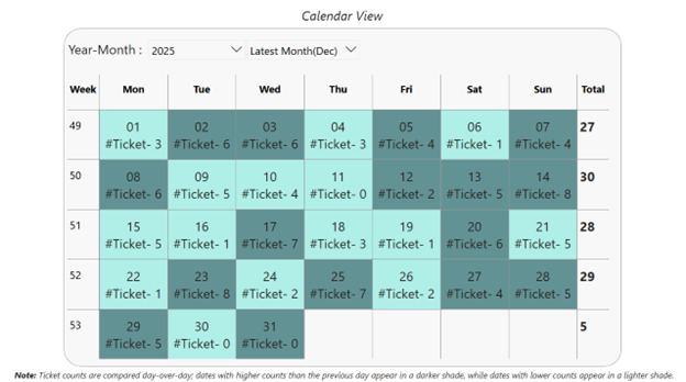
This matrix visual displays a month-wise calendar view, where dates are organized by day of the week and week of the year. Each row represents a week, and each column represents a weekday, creating a familiar calendar layout. The view updates dynamically based on the selected year and month, making it easy to analyze data in a clear, calendar-based structure.
Below are the steps to create a calendar view using the Matrix visual in Power BI.
Step 1: Create a Date Table
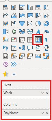
- Build a dedicated Date table.
- Include essential columns such as Date, Week of the Year, and Day Name.
- Use Week of the Year in the Rows section of the Matrix visual.
- Use Day Name in the Columns section of the Matrix visual.
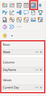
Step 2: Date Display Measure
- Create a measure to display the day number inside each calendar cell.
- This measure extracts the day (DD) from the date context in the matrix.
- Add the Current Day measure to the Values section of the Matrix visual.
- This ensures each cell displays the corresponding calendar date, making the matrix look and behave like a calendar.
DAX for Cuurent day
Current Day = FORMAT(MAX(‘Date'[Date]),”DD”)
With this step, the basic calendar view is ready and can be further customized as needed.
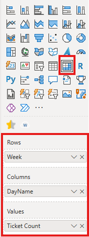
Step 3: Add Context to the Calendar Using Measures (Enhanced Version)
- Enhance the calendar by adding business context to each date cell.
- Create a measure that displays additional information (for example, ticket count) alongside the date.
Ticket Count =
VAR most_selling_product = TOPN(1,
SUMMARIZE(Ticket,Ticket[Ticket Status],”total ticket”,COUNT(Ticket[Ticket ID])),
[total ticket])
var product_name= MAXX(most_selling_product,Ticket[Ticket Status])
RETURN
IF(ISINSCOPE(‘Date'[DayName]),
[Current Day] & REPT(UNICHAR(10),1)&
“#Ticket- ” & COUNT(Ticket[Ticket ID])+0&REPT(UNICHAR(10),1)
,FORMAT([Total Ticket],0)) - When the day level is in scope, the measure:
- Shows the day number.
- Adds a line break for better readability.
- Displays the ticket count for that specific date.
- When the view is not at the day level (such as totals), the measure returns the aggregated ticket count.
- Add this measure to the Values section of the Matrix to enrich each calendar cell with meaningful insights.
Step 4: Apply Conditional Formatting to the Calendar View
- Use conditional formatting to visually highlight day-over-day changes in the calendar.
- Create a measure that compares the current day’s ticket count with the previous day’s ticket count.
CF Color =
VAR CurrentSales =
[Total Ticket]
VAR PrevDaySales =
CALCULATE(
[Total Ticket],
DATEADD(‘Date'[Date], -1, DAY)
)
RETURN
IF(
NOT ISBLANK(PrevDaySales) && CurrentSales < PrevDaySales,
“RGBA(64, 224, 208,0.4)”, — Teal (darker) for decrease
“RGBA(0, 79, 81,0.6)” — Teal (lighter) for increase
) - Calculate the previous day’s value using a date shift logic.
- Apply different background colors based on the comparison:
- A lighter shade to indicate an increase compared to the previous day.
- A darker shade to indicate a decrease compared to the previous day.
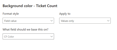
- Use this measure in the background color conditional formatting of the Matrix visual
Conclusion
Adding Year and Month slicers allows users to dynamically control the time period displayed in the calendar, making it easy to navigate across different months and years while keeping the calendar structure consistent. By setting these slicers to default to the latest month and year, the report always opens with the most relevant and up-to-date view.
When combined with a Matrix-based calendar layout, contextual measures, and conditional formatting, this approach delivers a fully native, flexible calendar solution in Power BI—eliminating the need for external visuals while maintaining a clean and interactive user experience.