
Hello DAX-sters!
Have you ever wanted to show data as per your choice in a visual, i.e. you get the freedom to choose whether you want to plot the data of Order/Sales, or Profit/Loss.
There is no custom visual which gives you an option to choose what value you want to show.
There is a small trick through which we can achieve this thing.
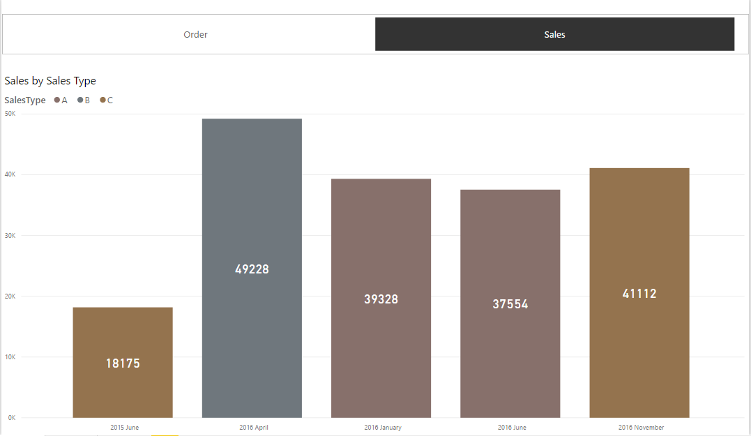
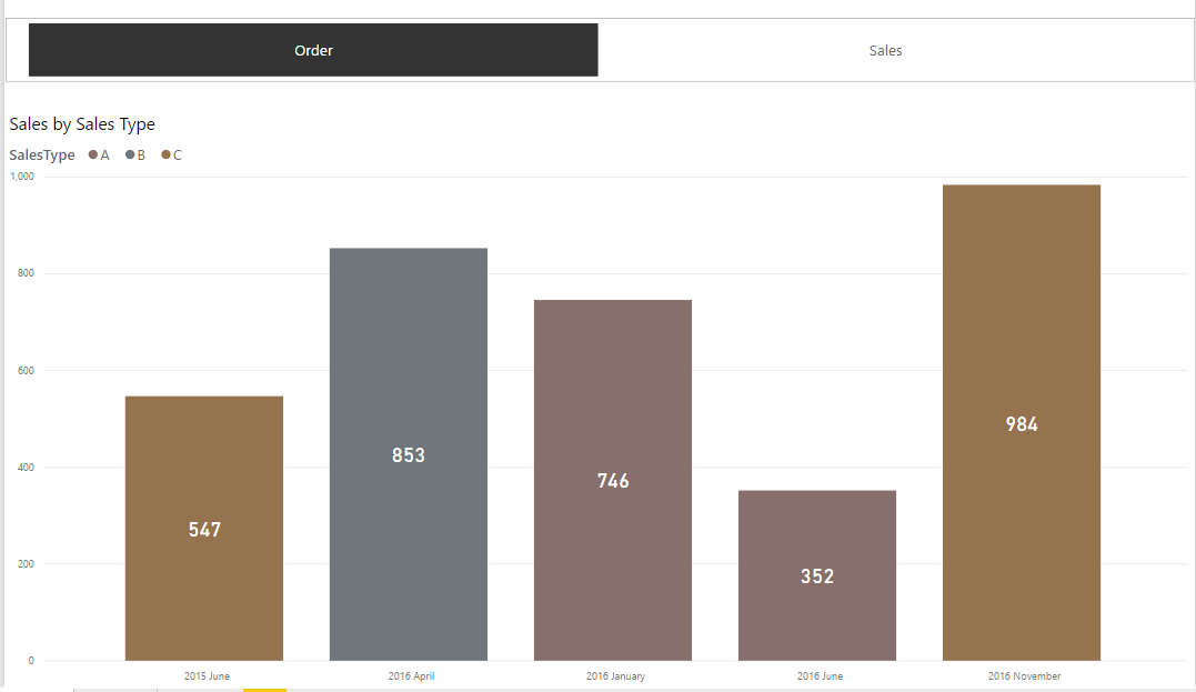
Let’s create a report which has a slicer which lets you choose to show monthly data of Sales or Order in the visual below:
For illustration purpose, we’ll have data of Sales and Order over 2 years.
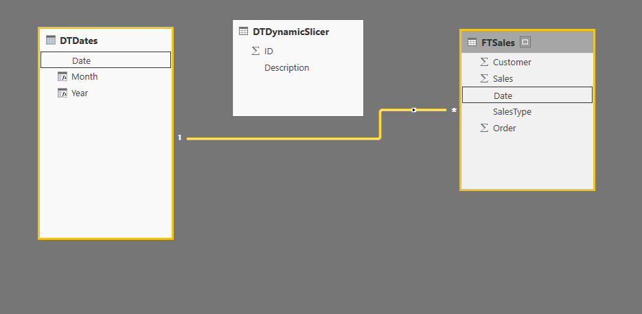
For the Sales Data, we have Fact table – FTSales.
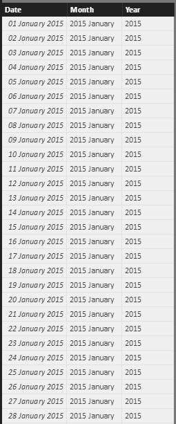
And then, we will have Dates table(DTDates), which can be created by the following DAX formula:
Date = CALENDAR(DATE(2015,01,01),DATE(2016,12,31))
And, with calculated columns as:
Year = YEAR(DTDates[Date])
Month = DTDates[Year]&" "&FORMAT(DTDates[Date],"MMMM")
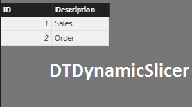
Once done, the DTDates table will look like this:
With this we have basic structure with Fact table and Dates table ready for use. However, we will need to add one more table to pick the option about the kind of data you want to show.
Hence, for slicer, we will have DTDynamicSlicer Table which can be imported as an excel file or can create table using ‘Enter Data’ in Home ribbon.
Now, we need to create relationships between the tables as:
For total Sales and total Order, let’s create basic measures which we would need for plotting:
Total Order = SUM('FTSales'[Order])
Total Sales = SUM('FTSales'[Sales])
Now, we need to create dynamic measure which will help us to plot data as per the selected option, i.e. it would calculate whether we want Total Sales or Total Order.
DynamicMeasure: SWITCH(FIRSTNONBLANK(DTDynamicSlicer[Description],1)
                       ,"Sales",[Total Sales]
                       ,"Order",[Total Order]
                      )
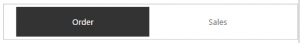
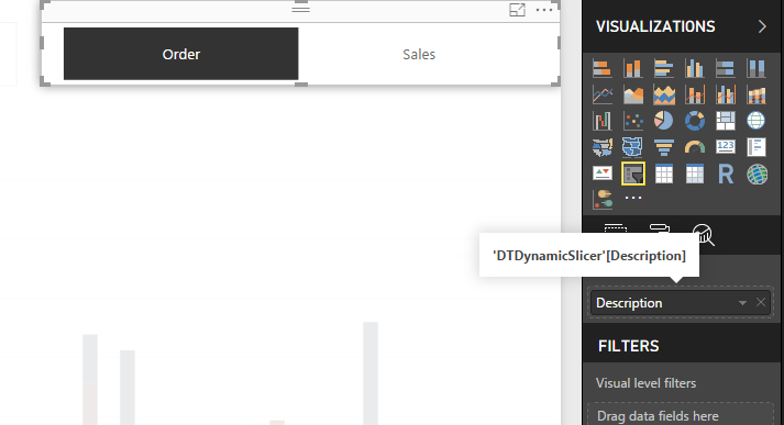
Add slicer for choosing whether to show Sales data or Order data, which will be plotted from ‘DTDynamicSlicer’.
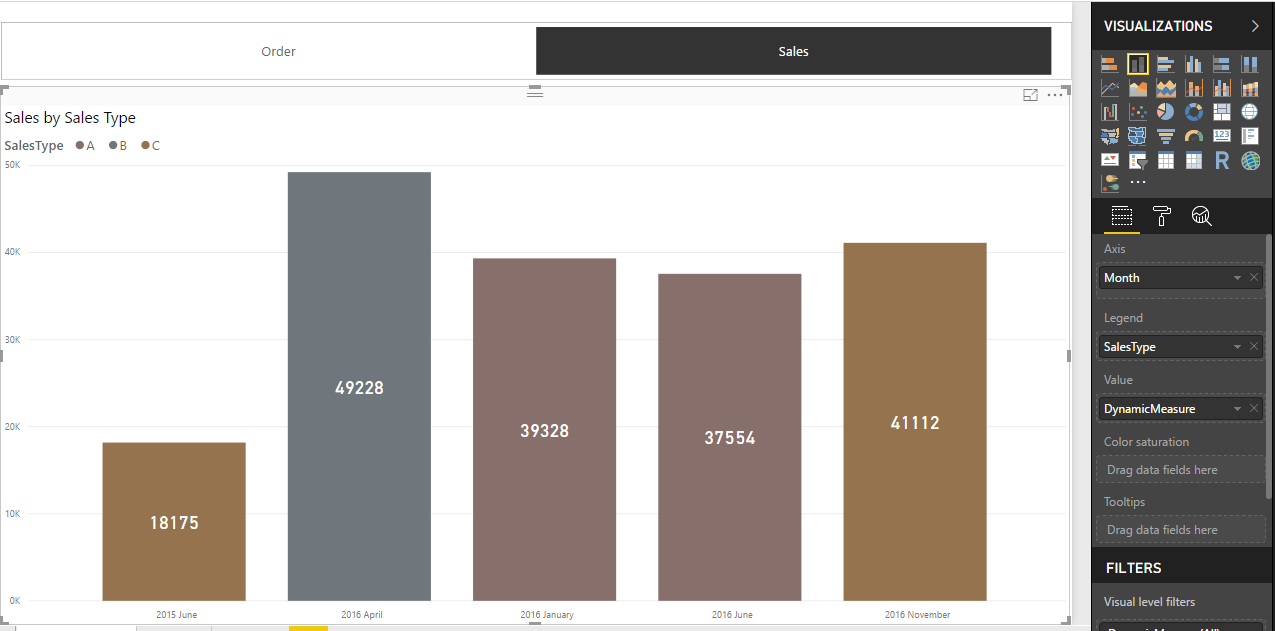
For the main visual, Axis will have Month column from DTDates table (if we want to show our data monthly) and Value will have our created measure “DynamicMeasure”.
Plot the visual as follows:
Let us understand how this works,
Let’s say we want to show data of sales, so we will select ‘Sales’ on the slicer.
Hence, according to DynamicMeasure, FIRSTNONBLANK() function will give result as ‘Sales’ because Sales is selected and then it will calculate Total Sales as per the measure created. If Order was selected, it would calculate Total Order.
Thus, we can have as many options as we want in the slicer and show the data accordingly.
Happy DAX-ting!
INKEY is your solution partner.
Our focus is to deliver you in-time intelligent innovative solutions ("key") for the problems in hand. Maintaining a quality standard right from the inception of a project is our top most priority.
Our team of talented professionals will execute your projects with dedication and excellence. We take ownership and accountability for the effort that goes into meeting our client’s needs.
Years of experience and proven success of delivering innovative custom solutions.


© All Rights Reserved. Inkey IT Solutions Pvt. Ltd. 2024


[…] We have already created a report where we can choose what data we can show – dynamically. You can refer to the blog here. […]