Creating the Linear Gauge to Check the Status of Sales in Power BI
Microsoft Power BI offers an extensive range of charts and graphs designed to visually represent data, facilitating insightful analysis for making informed business decisions. Occasionally, stakeholders prefer a broad overview of their performance and target achievements, categorized into percentage ranges, without delving into precise figures. While Power BI lacks a built-in linear gauge visual akin to SSRS, it’s possible to construct a custom linear gauge using certain techniques. Below, we outline step-by-step instructions for creating this custom gauge within Power BI.
Step 1:
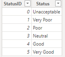
Creating Status Bar table which contains status id and status (name of status which we want to categorize target achieved) as below:
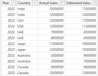
For the demo purpose we have created Sales table as displayed below:
Step 2:
Creating measure for Actual Sales, Estimated Sales, and Target Achieved.
Total Actual Sales =
SUM(Sales[Actual Sales])

Total Estimated Sales =
SUM(Sales[Estimated Sales])

Target Achieved =
DIVIDE(
    [Total Actual Sales],
    [Total Estimated Sales],
    0
)
Discover the power of our services:
Microsoft Fabric, Power BI, Microsoft Business Intelligence, SQL Server, and Business Central. By the power of these services, from advanced analytics to seamless business integration, we’ve got the expertise you need to optimize operations and drive growth. Harness the potential of your data infrastructure with our comprehensive suite of solutions.
Step 3:
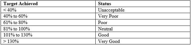
Now we will frame conditions for Status that we want to display based on Target Achieved.
To implement and check this condition in Power BI we will create a Status Indicator measure as below:
Status Indicator =
VAR TargetAchieved = [Target Achieved]
RETURN
SWITCH(
    TRUE(),
    [Target Achieved] <= 0.4,0,
    [Target Achieved] <= 0.6,1,
    [Target Achieved] <= 0.8,2,
    [Target Achieved] <= 1,3,
    [Target Achieved] <= 1.3,4,
    [Target Achieved] > 1.3,5
)
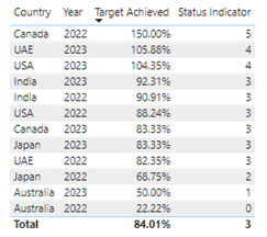
This measure will return 0,1,2,3,4, or 5 based on Value of target Achieved which is displayed below:
Step 4:
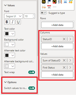
Creating Linear gauge using the Matrix visual.
In matrix we will plot Status ID in column and Sum of Status ID and Status (with Aggregation set to “First”) in Values.
From Values option in Format Pane, we will turn on the toggle of “Switch Values to row”.
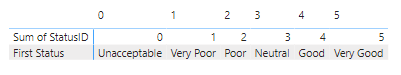
After doing above steps our matrix will look as shown below:
Step 5:
Creating the Pointer
Now to Point in which Status Category is our “Target Achieved” lies we will create a simple measure as below with pointer marks, we want to display for each status.
Pointer =
VAR StatusID =  SELECTEDVALUE('Status Bar'[StatusID])
VAR CurrentStatus = [Status Indicator]

RETURN
SWITCH(
    TRUE(),
    CurrentStatus = 0 && StatusID =  CurrentStatus,"😭",
    CurrentStatus = 1 && StatusID =  CurrentStatus,"🙁",
    CurrentStatus = 2 && StatusID =  CurrentStatus,"😕",
    CurrentStatus = 3 && StatusID =  CurrentStatus,"🙂",
    CurrentStatus = 4 && StatusID =  CurrentStatus,"😁",
    CurrentStatus = 5 && StatusID =  CurrentStatus,"🤩",
    ""
)
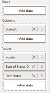
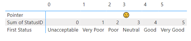
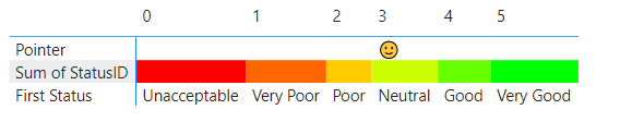
We will plot this measure just above the Sum of StatusID in the Values section of Matrix.
We can see that our Linear Guage has started getting in Shape.
Step 6:
Formatting the Matrix
Now to make our matrix look like linear gauge we will apply conditional formatting and some other basic formatting.
First, we will apply conditional formatting to Font and Background of Sum of StatusID as displayed below:
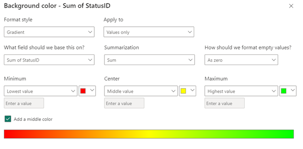
Now our matrix looks like Linear Gauge.
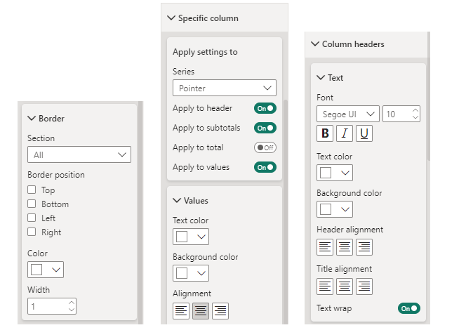
To give it a final touch we will perform basic formatting like hiding column headers, removing border line of matrix and removing Pointer and First Status row header by simply turning font color and background color white or theme color you are using for your report background.
After final touch and adjustment of column width we have our linear gauge ready!
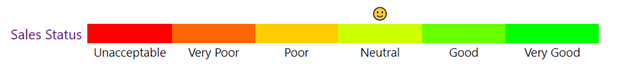
This linear gauge can now be used in your report as a standalone visual which dynamically changes its pointer as we change the slicer selection just as we do for other visuals.
Conclusion:
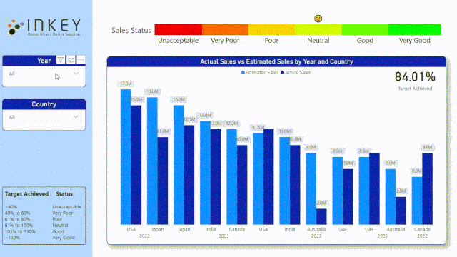
In conclusion, by leveraging Microsoft Power BI‘s customization capabilities, we’ve successfully created a custom linear gauge to visually assess sales performance. Through step-by-step instructions, we’ve demonstrated how to define status indicators based on target achievement percentages and construct the gauge using a matrix visual. With simple formatting adjustments, this dynamic gauge provides stakeholders with a comprehensive overview of sales performance, facilitating informed decision-making in business contexts.
Know the number of records in any Dataverse entity or table.
https://inkeysolutions.com/entity-record-counter
ATM Inspection PowerApp to ease ATM inspection and report generation process.
https://inkeysolutions.com/microsoft-power-platform/power-app/atm-inspection
Insert data into Many-to-Many relationship in Dynamics CRM very easily & quickly, using the Drag and drop listbox.
http://inkeysolutions.com/what-we-do/dynamicscrmaddons/drag-and-drop-listbox
Comply your Lead, Contact, and User entities of D365 CRM with GDPR compliance using the GDPR add-on.
https://inkeysolutions.com/microsoft-dynamics-365/dynamicscrmaddons/gdpr
Create a personal / system view in Dynamics CRM with all the fields on the form/s which you select for a particular entity using the View Creator.
http://inkeysolutions.com/what-we-do/dynamicscrmaddons/view-creator