Enhancing Column chart for Variance Analysis in Power BI: A Step-by-Step Guide
In the dynamic landscape of business analytics, tracking and comparing sales or profit variances across different categories or countries is essential. While Power BI has been a go-to tool for visualizing data, the conventional methods of representing variances were limited. In this technical blog, we will explore how to leverage the reference line feature in Power BI to create a variance line in a clustered column chart, providing a comprehensive view of sales variances.
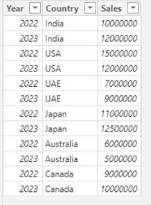
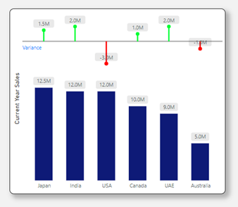
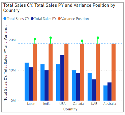
Below is the input data and expected output
Step 1:
Creating Measures for Total Sales, Current Year, and Previous Year
To begin, we need to create measures for Total Sales, Total Sales Current Year (CY), and Total Sales Previous Year (PY). These measures lay the foundation for our variance analysis.
Total Sales =
SUM('Country Sales'[Sales])

Total Sales CY =
CALCULATE(
    [Total Sales],
    'Country Sales'[Year] = 2023
)

Total Sales PY =
CALCULATE(
    [Total Sales],
    'Country Sales'[Year] = 2022
)
We demonstrate how to make these measures dynamic by using TODAY() and PREVIOUSYEAR() functions.
Total Sales CY =
CALCULATE(
    [Total Sales],
    'Country Sales'[Year] = YEAR(TODAY())
)

Total Sales PY =
CALCULATE(
    [Total Sales],
    'Country Sales'[Year] = PREVIOUSYEAR('YourDateTable'[Date])
)
Step 2:
Setting Up the Clustered Column Chart
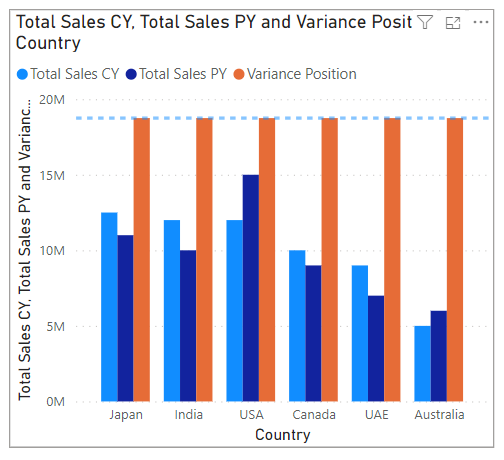
Utilizing a clustered column chart, we plot countries on the X-axis and Total Sales CY and Total Sales PY on the Y-axis. This step establishes the basic structure of our visualization.

Discover the power of our services:
Microsoft Fabric, Power BI, Microsoft Business Intelligence, SQL Server, and Business Central. By the power of these services, from advanced analytics to seamless business integration, we’ve got the expertise you need to optimize operations and drive growth. Harness the potential of your data infrastructure with our comprehensive suite of solutions.
Step 3:
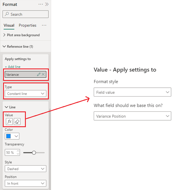
Adding the Reference Line
To enhance the chart, we introduce a reference line. By selecting “Add line” in the format pane, we create a constant line named “Variance” positioned at 1.5 times the maximum current year sales. A dedicated measure, Variance Position, is crafted to dynamically fix the reference line’s position.
Variance Position =
MAXX(
    ALLSELECTED('Country Sales'[Country]),
    [Total Sales CY]
) * 1.5
Step 4:
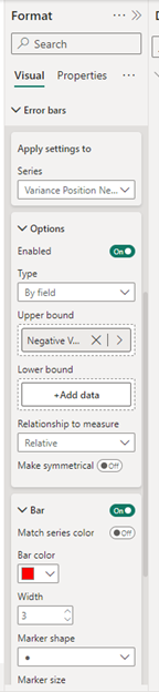
Incorporating Error Bars for Positive Variance
We extend the analysis by adding error bars to represent positive variances. Creating measures for variance, positive variance, and negative variance, we configure the error bars in the format pane. This step provides a visual representation of positive variances above the reference line.
Variance =
[Total Sales CY] - [Total Sales PY]

Positive Variance =
IF(
    [Total Sales CY] > [Total Sales PY],
    [Variance]
)

Negative Variance =
IF(
    [Total Sales CY] < [Total Sales PY],
    [Variance]
)

Step 5:
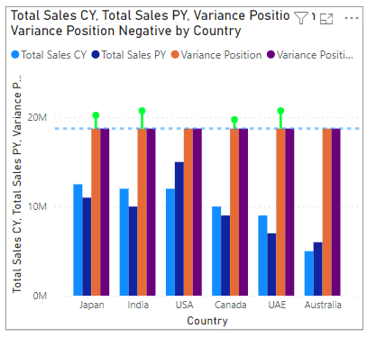
Including Negative Variance in the Reference Line
Expanding our analysis further, we add a placeholder for negative variance. Following a similar procedure as Step 4, we distinguish negative variances by changing the color of the bars to red.
Step 6:
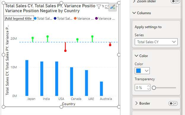
Adjusting Transparency and Positioning Error Bars
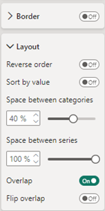
To streamline the visualization, we make unnecessary columns transparent. By adjusting layout options and increasing the space between series, we position the error bars right above the Total Sales CY column.
Step 7:
Final Formatting
The finishing touches involve formatting the chart for a visually appealing and user-friendly experience. This includes removing titles, axes, legends, and adding data labels to convey information effectively.

Conclusion:
Through the strategic use of reference lines and error bars, we have demonstrated an enhanced approach to sales variance analysis in Power BI. This method not only provides detailed insights with minimal effort but also eliminates the need for custom visuals, offering a more streamlined and efficient solution for users.
Know the number of records in any Dataverse entity or table.
https://inkeysolutions.com/entity-record-counter
ATM Inspection PowerApp to ease ATM inspection and report generation process.
https://inkeysolutions.com/microsoft-power-platform/power-app/atm-inspection
Insert data into Many-to-Many relationship in Dynamics CRM very easily & quickly, using the Drag and drop listbox.
http://inkeysolutions.com/what-we-do/dynamicscrmaddons/drag-and-drop-listbox
Comply your Lead, Contact, and User entities of D365 CRM with GDPR compliance using the GDPR add-on.
https://inkeysolutions.com/microsoft-dynamics-365/dynamicscrmaddons/gdpr
Create a personal / system view in Dynamics CRM with all the fields on the form/s which you select for a particular entity using the View Creator.
http://inkeysolutions.com/what-we-do/dynamicscrmaddons/view-creator